Simplifying Customer Onboarding with the No-code Workflow Builder Tool.
Simplifying Customer Onboarding with the No-code Workflow Builder Tool.
Role
Product designer
Industry
Compliance & Security
Duration
Q4 2022 -Q2 2023


About the Project
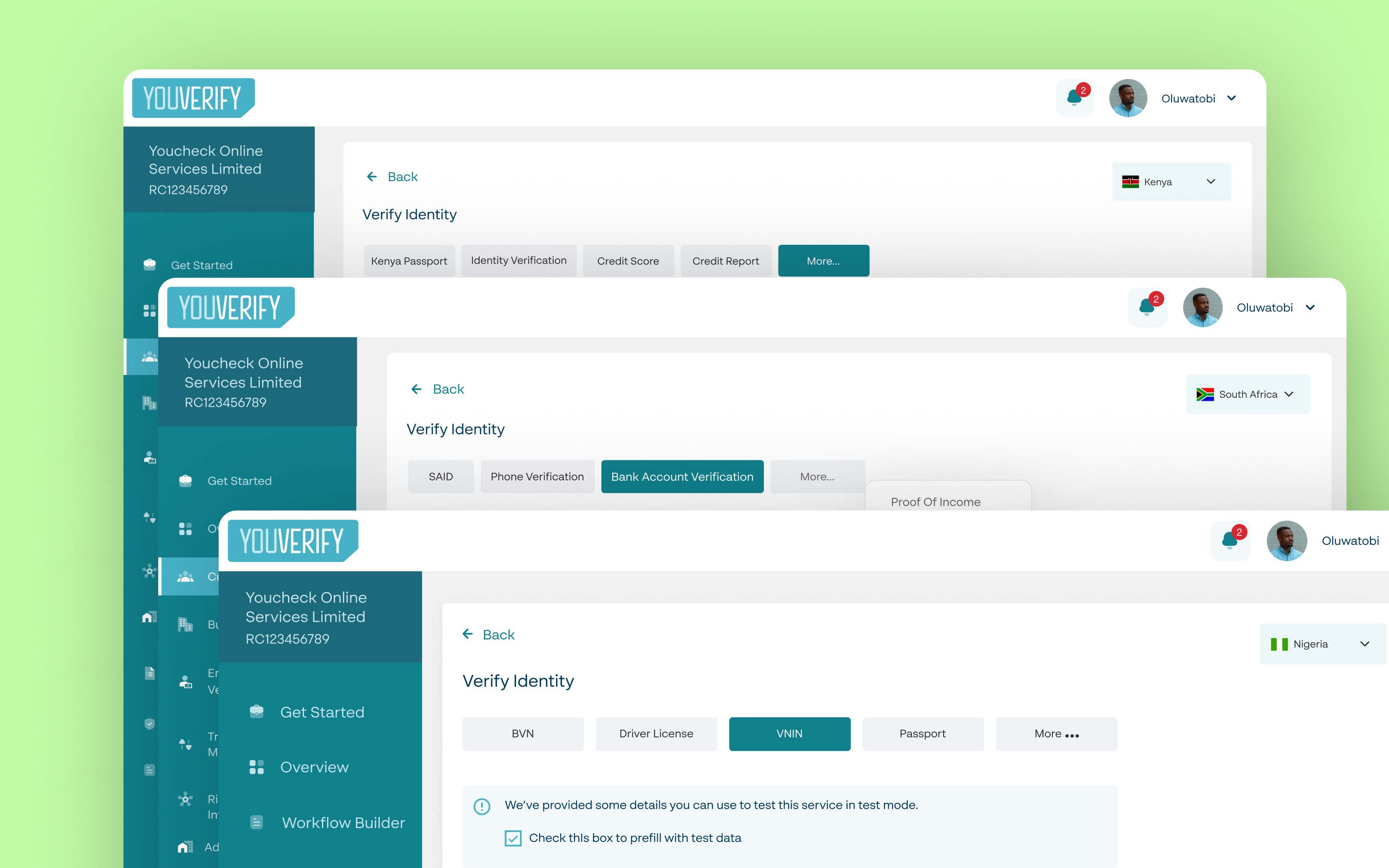
The Youverify Workflow Builder Tool is a no-code tool that enables businesses to automate their customer onboarding process. On the Workflow Builder, they can create and customize forms for their clients that can automatically perform KYC, KYB, Liveness checks and AML checks as the forms are filled and submitted.
My role in this project was to improve the existing designs and add new features to the workflow builder tool. I also designed dashboards, and reports and created ready-made customized forms for businesses.
Understanding how the Product Works
When I was onboarded to work on this project the workflow builder had already been built as a version 1.0. And it was going through continuous rounds of testing and improvement. I initially struggled to understand the purpose of the tool, but using the tool personally provided valuable insights that enabled me to contribute meaningfully to improving the user experience.
The tests we conducted both internally and externally, revealed usability issues that would make it difficult for our customers to use. If they were unable to use it, they would be unwilling to pay for it.
Using Guided Interactions to Refine User Experience
We understood that users would experience a steep learning curve when using the tool to create and customize their forms and it was important to us that we provided guided and intuitive user experience as they carried out tasks on the platform. As a designer on the team, one of the ways I accomplished this was by providing tool tips that provided bit-size explanations of a feature, and what a field required from them. Presenting pop-up modals to explain the implication of actions they had initiated and confirm destructive actions.


Making Intuitive Microcopies
One important area of improvement was how we named buttons, features and even text fields. We had a lot of feedback about users not understanding what a feature was for or what would happen if they clicked on a button. They didn’t understand the naming conventions that we used because they didn’t properly describe the function.
For example, we had a feature that was formerly called ‘Add Field’ and clicking on that button led to a section that had a list of different sections you could add to the form like a Personal information section that comprised a full name text field, DOB text field, Country field etc. But the button said ‘Add field’ but you aren’t adding just a field, the user is adding a section, a component and so we renamed it to ‘Add Component’.
Improving Usability through Brand Style Guide Integration
Studying the user journey when using the tool to create forms, we noticed that the users had to customize every form they made. They had to set for example the background colour, the button colour, and the text colour every time they wanted to create a new form. If they chose not to they would be stuck with the default colours which didn’t align with their branding. We wanted to provide an option for users to set their branding once and never worry about it again or until they change their branding later in future.
It was challenging figuring out the best user experience for this because there were a lot of settings and configurations that had to be on one page. The Engineers also pointed out a lot of implementation constraints to the different solutions that were brought to the table.
“Do we divide the settings into sections and place them in separate tabs? And maybe run the risk of hiding sections that aren’t displayed by default?”
“How long would it take the front-end Engineer to implement the different versions of solutions that we came up with?”
These questions informed my design decisions, as I designed not only for a better user experience but also to consider the various engineering constraints. After making a few iterations, I was able to design the default feature that allowed users to customize their form settings based on their branding and also a Preview section where they could see what the form would look like as they make changes.


Impact
We noticed a reduction in our customer support tickets over time. The Sales team also reported positive feedback from customers who found the tool easier to use after the recent improvements.
Key Takeaway
Being a part of the team that worked on this project provided me with experience in designing complex systems. It’s one thing to get PRDs from my PM and jump on Figma but I had to understand the product, understand the value it could provide to the users and business before I could do meaningful design work to improve it.

