Personal Banking for Farmers and Small Businesses in Rural Nigeria.

Personal Banking for Farmers and Small Businesses in Rural Nigeria.

Role

Product Designer

Industry

Financial Technology

Duration

Q4 2023 - Q2 2024

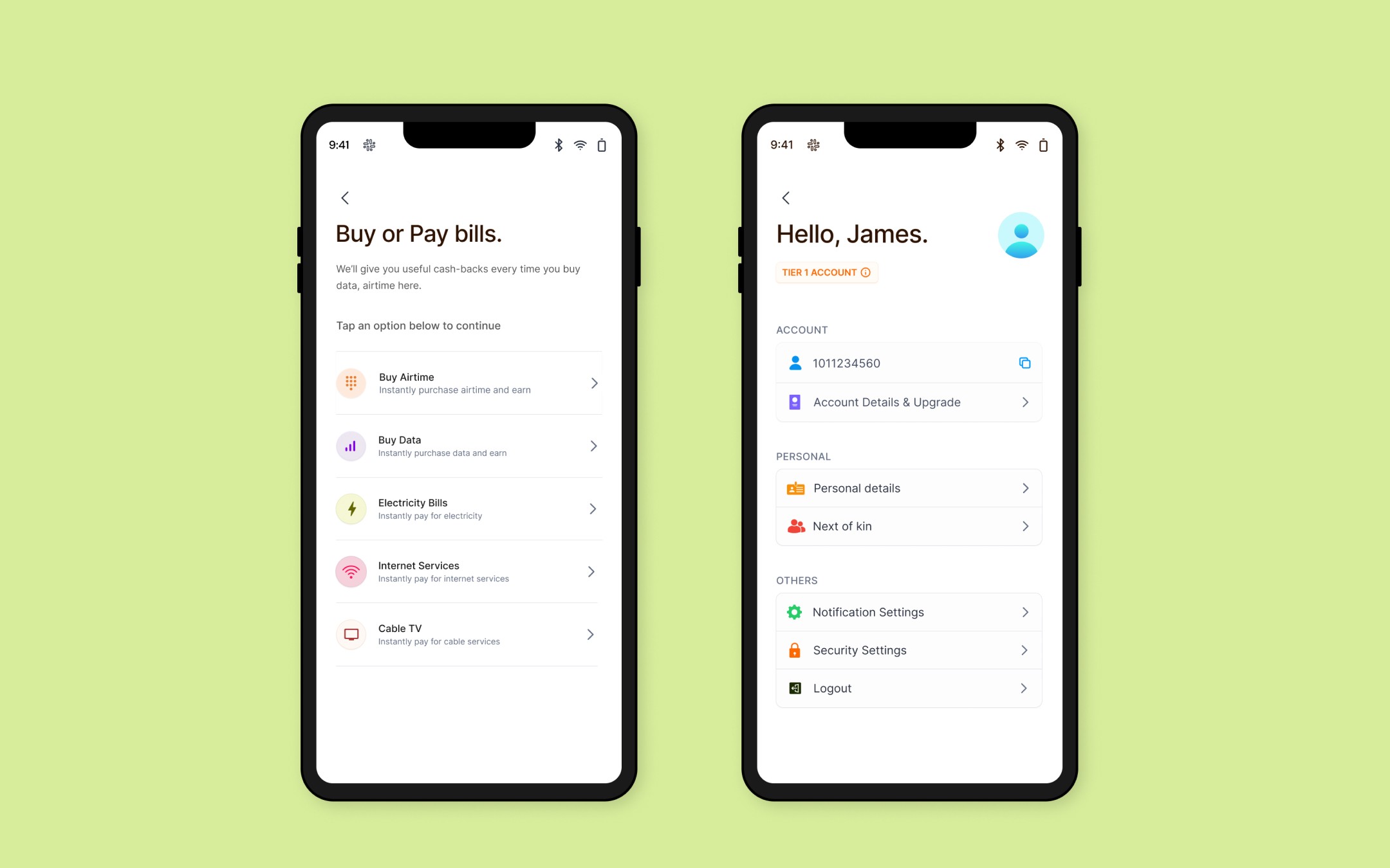
Crust Personal screens

About the Project

Crust is a microfinance bank that offers banking services to farmers and agricultural SMEs in rural areas in Nigeria. The personal banking application enables these people to meet their financial needs such as carrying out frequent transactions and saving money in their account.

My responsibilities as a product designer on the team are contributing to product and design strategy, and designing the end-to-end application for our intended customers while meeting business needs and product requirements.

Problems to be solved

To build a meaningful solution, we first needed to understand the key challenges faced by our target users, we carried out surveys and interviews and we identified 2 major pain points for farmers.

  1. Farmers found it difficult to save money because there were no features within the traditional bank app that encouraged them to do so.

  2. The existing online banking experience lacked seamless transactions and an intuitive interface and navigation.

Beyond these challenges, our discovery sessions with the team surfaced two key design questions:

  1. How can we incorporate dedicated savings accounts and conventional spending accounts into a single mobile banking app?

  2. How can we make the application inclusive and accessible so farmers can take advantage of its capabilities, regardless of their level of technological expertise?

Roadmap to a solution

Now, with a clear understanding of the pain points, we carried out competitive analysis to explore how existing solutions in the market addressed these challenges and identify areas for differentiation. This analysis allowed us to pinpoint opportunities that could shape our value proposition—even if it was through a small but impactful unique feature.

With Miro, we used insights obtained from the competitive analysis and surveys to come up with possible solutions to the pain points we identified. We were able to prioritise the most effective solution by evaluating the impact versus effort for each option.

Crust personal screens

Navigating the user's path

When determining what a user would be required to do to be onboarded to the app, user flows assisted the team in having a bird’s eye view of what onboarding would look like and what we were asking users to provide to create an account successfully. It also enabled engineers to identify technical constraints early on and suggest feasible alternatives. For a user to be successfully onboarded into the app they had to complete the following steps:

  1. Phone number verification. A One-time password is sent to the phone number they provide.

  2. Create a Login passcode. A secure passcode is required for account access.

  3. Bank verification number (BVN) verification. A unique number for the Nigerian bank account holder is verified.

  4. Liveness check. A facial comparison is conducted between the BVN image and a live captured image.

  5. Place of birth. Users provide details of where they were born as part of KYC requirements.

  6. Provide residential address. Basic information about where they lived is collected.

  7. Create a Transaction PIN. A 6-digit PIN is required for all transactions.

  8. Enable biometrics on their devices. Users are prompted to enable fingerprint or facial recognition for enhanced security.

The challenge in creating the onboarding flow was deciding what comes first and why. The steps are divided into verification and personalization steps, we arranged the steps in no particular order but 3 steps had to be positioned intentionally.

  1. Phone number verification had to come first. We needed to validate that the phone number belonged to a real person and this required the person a One-time Password sent to the phone number they provided.

  2. BVN verification had to come before the Liveness check. The image attached to a person’s BVN would be used for a facial comparison with the image obtained from the liveness check.

User flows were crucial for the team. Similar to the onboarding flow, they allowed us to map out how users could complete various tasks on the app before diving into design.
Designing for Users to Succeed

One of the early decisions we made on the design team was to champion our users while they interact with the app. We aimed to prevent confusion and frustration by guiding users to avoid errors and helping them resolve issues when they occur. We successfully translated this approach into our designs. Examples of how we translated this into our designs:

  1. We added explanatory texts to every onboarding step, explaining what is required at each step and why it is necessary for users to provide the requested information. With the texts, we wanted to create a more transparent onboarding process, encouraging users to trust us with their personal information and, ultimately their money.

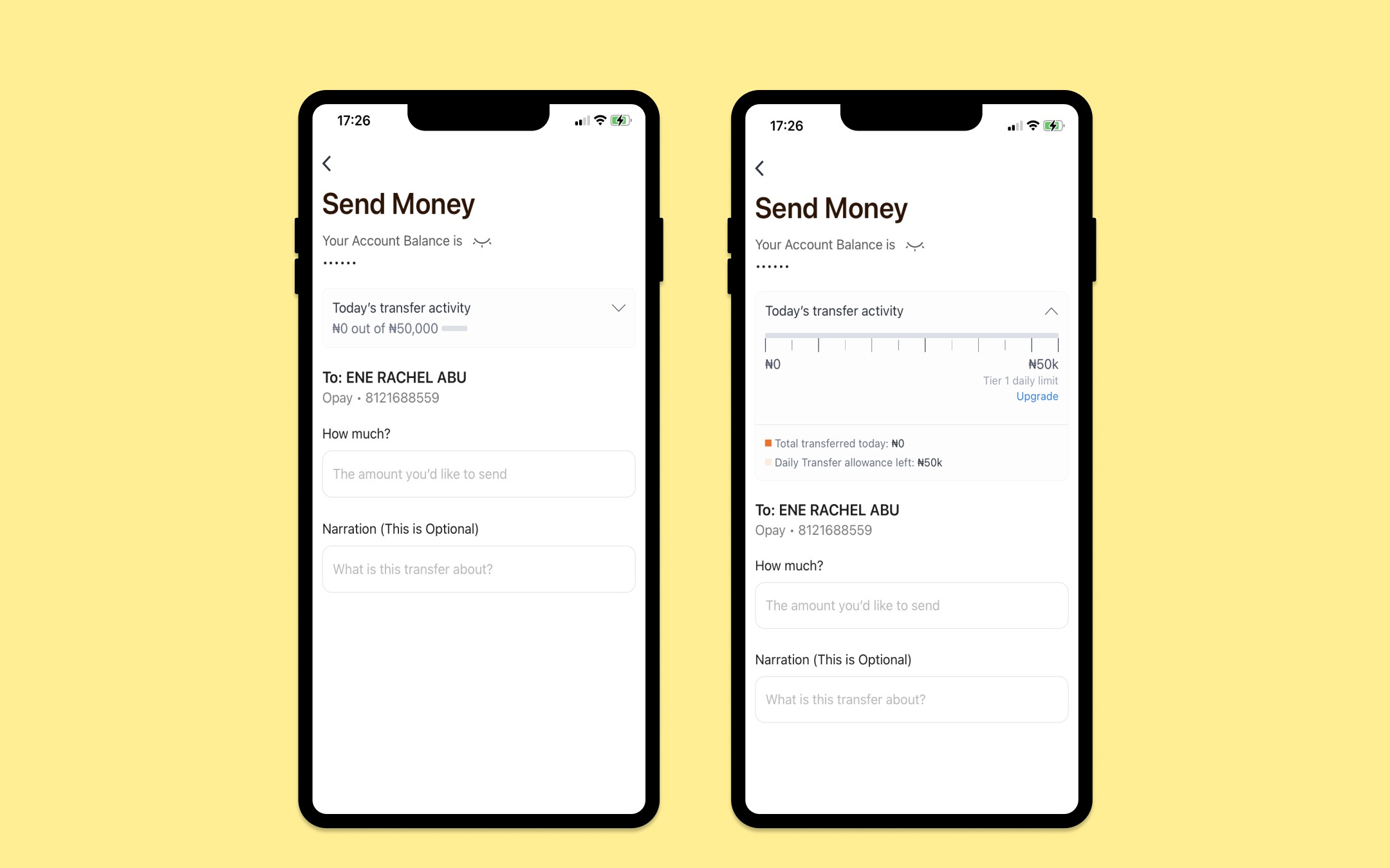
  2. When users make money transfers, we added a transfer scale at the top of the page. This scale shows their transfer activity, including how much they've transferred today and how much of their daily transfer limit remains. The goal of this visual cue is twofold: it provides users with a quick overview of their daily spending activity and prevents them from accidentally exceeding their daily transaction limit.

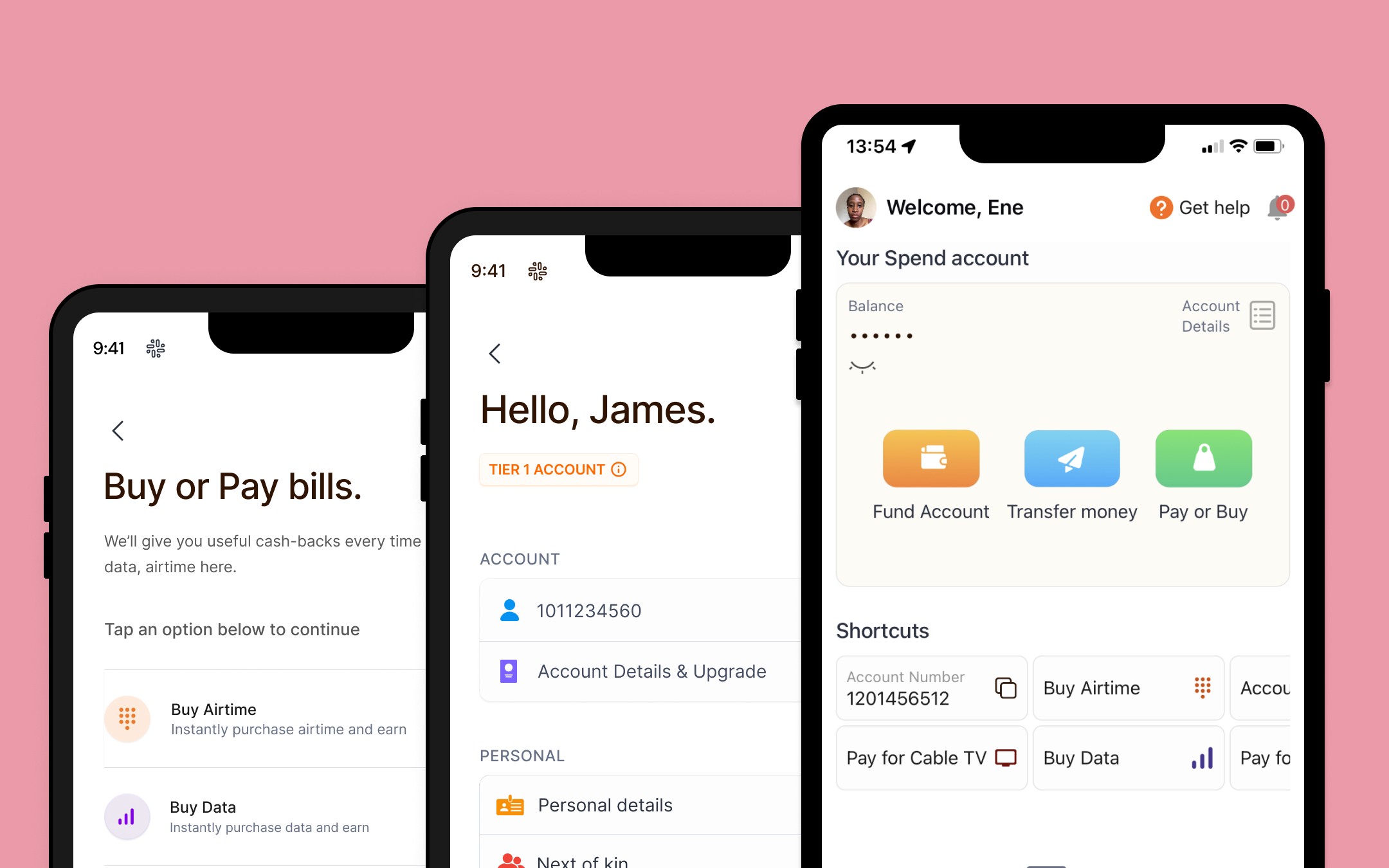
  1. On the homepage, we have a shortcut carousel containing transactions we assume users would want to make more frequently. Placing these shortcuts on the homepage helps save time, allowing users to carry out transactions faster and more conveniently.


Send money screen
Send money screen
Send money screen

Addressing the Savings Challenge

Storytelling played a vital role in selling the savings account to potential users, we created a slide presentation highlighting why they need to save and why they should save with us. We then introduced them to the different saving plans designed to meet their savings needs, allowing them to see how each plan works.

Users can test savings plans before committing. For example, to explore Crust Vault—a fixed deposit savings plan—they can input a test amount. The app then calculates potential returns for various terms, such as 30 or 90 days. With this approach, users can confidently make a more informed decision on which savings plans best suit their financial goals.

In creating a savings plan, we wanted users to be able to set one up quickly. we reduced the number of steps they needed to create a plan. Users simply needed to provide the amount they wanted to save, select a tenure, and agree to the clearly stated terms and conditions. With these steps, their savings plan was created.

Impact

The Android version of the app has been launched and is available on Google Play Store with over 100 downloads.

Crust Personal on Google Play Store.

Crust Personal on Apple Store

Takeaways

Building this app reshaped my perspective on designing intentionally for our users. It’s easy to design an app a certain way because that’s how similar apps are typically built. But with every design decision, we challenged ourselves by asking “Why?” Why are we adding explanatory texts? why do we need to walk users through the savings plans, even though that would require extra screens? This helped us create intentional and user-focused designs.

Other projects

Copyright 2024 by Ene Abu

Copyright 2024 by Ene Abu

Copyright 2024 by Ene Abu